By Preston Fossee ‘16| Staff Writer
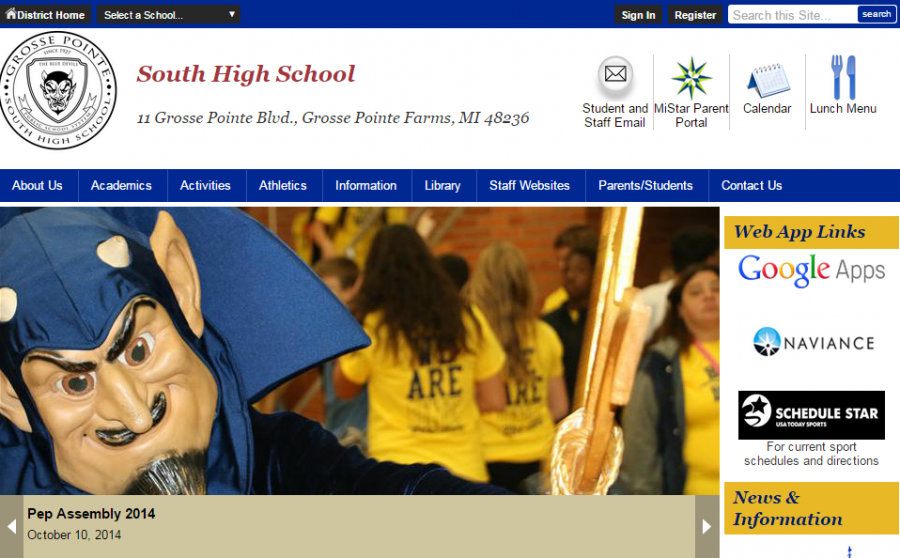
This summer Grosse Pointe Public Schools implemented multiple changes to its website, improving the layout both on desktops and mobile devices. Although this was meant to be a “smooth transition”, there are some shortcomings that need to be resolved before the full benefits of this new website can be realized.
In July, Schoolwires asked the school district if it was interested in a new and updated website, ironically called “Smooth Transition”. Schoolwires, a company that provides K-12 school websites, inquired if they would like a new layout that included more features, and everyone agreed that it was an excellent idea, according to Mary Kilimas, Grosse Pointe Public Schools webmaster. This update is referred to as a responsive template. Schoolwires describes their responsive template as an optimal viewing experience on any device, from desktop to smartphone.
The old website was taken down in August, and within a day the new one was up and running, but not to its fullest capabilities.
The new school website is in need of a little bit of touching up, and with time and support the web maintenance team for the school district may dramatically improve the site. One issue is simply an aesthetic one. Some of the buttons and information sections on South’s website look off and although it does not impede the functionality of the site, it could go a long way in making users more satisfied. Certain vertical and horizontal aspects could use better alignment and spacing.
With this new design, the district and schools’ mobile page has also been redesigned. It is very similar to the desktop page, and it provides all of the functionality that the desktop site does. All information is available with this new mobile layout, but it is a bit cluttered and finding certain pages can be difficult. For example, finding Pinnacle Gradebook can be difficult unless the link to the MiStar Parent Portal is clicked, which in turn leads to Pinnacle Gradebook. If the page was cleaned up and useful information was more accessible, this version would be much better. Some students are having similar troubles with the site.
“It’s annoying and I don’t like not being able to find things. It took me 20 minutes to find the staff websites page on my phone”, said Seth Carolan ‘16.
Possibly the biggest highlight of this new design was the introduction of the school districts very own application. The application is fully customizable to fit the needs of schools, students, and parents, allowing only the most important information to be displayed. This simplifies the process of accessing commonly-viewed information. Contact information and staff websites are only a few of the available functions.
The app has has some bugs in terms of crashing and logging in. When I opened the app for the second time, an error message popped up indicating it failed to log in with the same information that was used successfully five minutes before. Granted, these are small details, but in accumulation they create the feel of a program that is just a little off.
Kilimas expressed concern with the lack of feedback from the community. She said the community is not giving enough suggestions and content.
Pictures are of dire need. Because of the new site, pictures need to be added to the homepages of all the schools and district. Pictures from the old website we’re not been transferred over.
“I would love to have pictures – I need people to send me more pictures”, said Kilimas.
She is requesting that students or parents with any pictures they are comfortable having displayed on the websites homepage send them to her. She would love to see school daily life and events in the pictures. She can be contacted by visiting the school’s website and scrolling to the bottom for the “Questions or Feedback” section where anyone can contact her.
Overall, the new site is an improvement over the old design, but there are still changes that need to occur before the full potential of this new website can be utilized.
There are some clear shortcomings, but with time and the involvement of the community, the district can work towards a better, well-rounded website and app that suits everyone’s needs and keeps all happy. If information is more clearly labeled, this website will be easier to use and more appreciated by the community.

